som-num (𝘴𝘭𝘦𝘦𝘱𝘺)
- Report
1 year ago by Yash
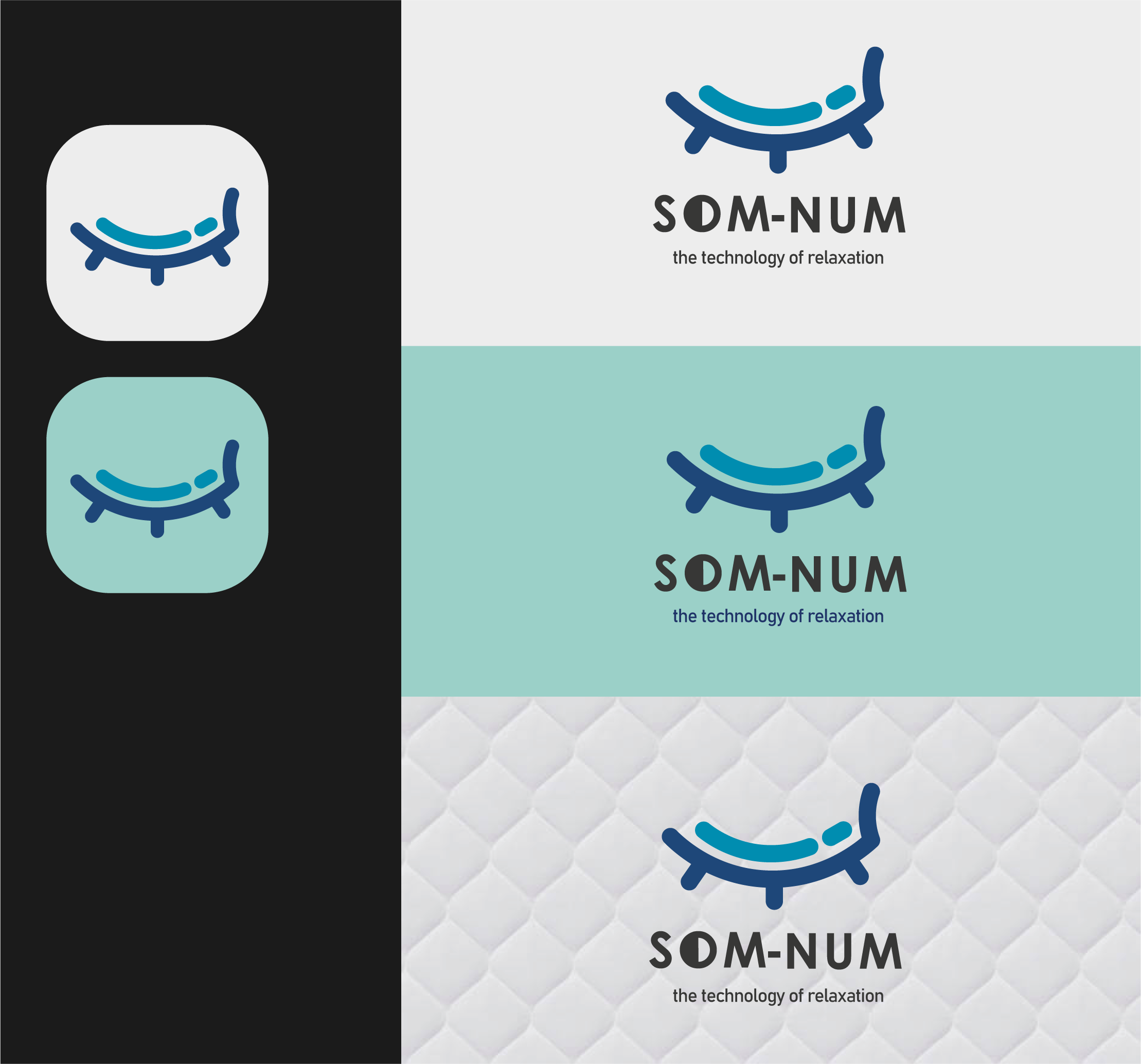
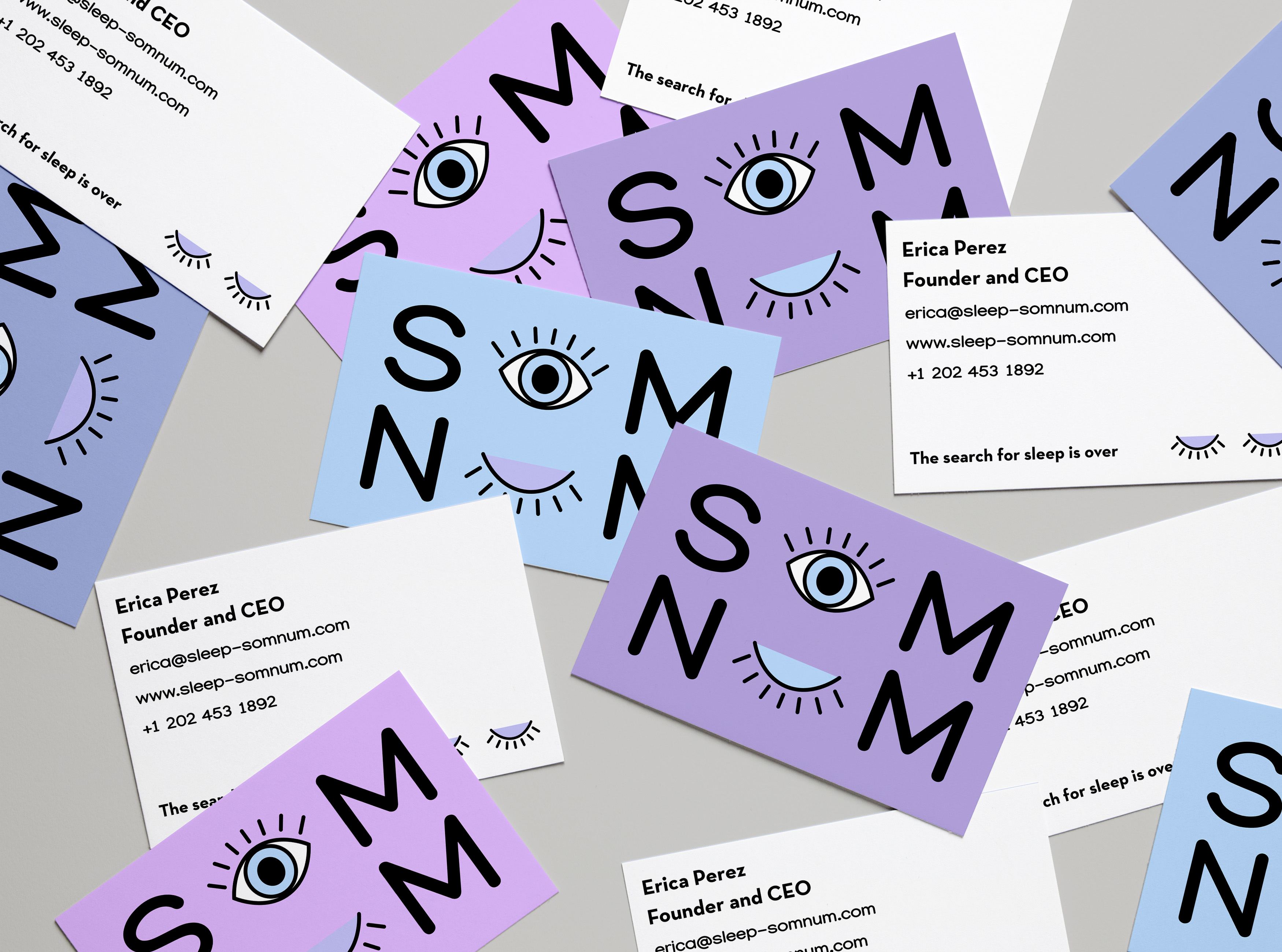
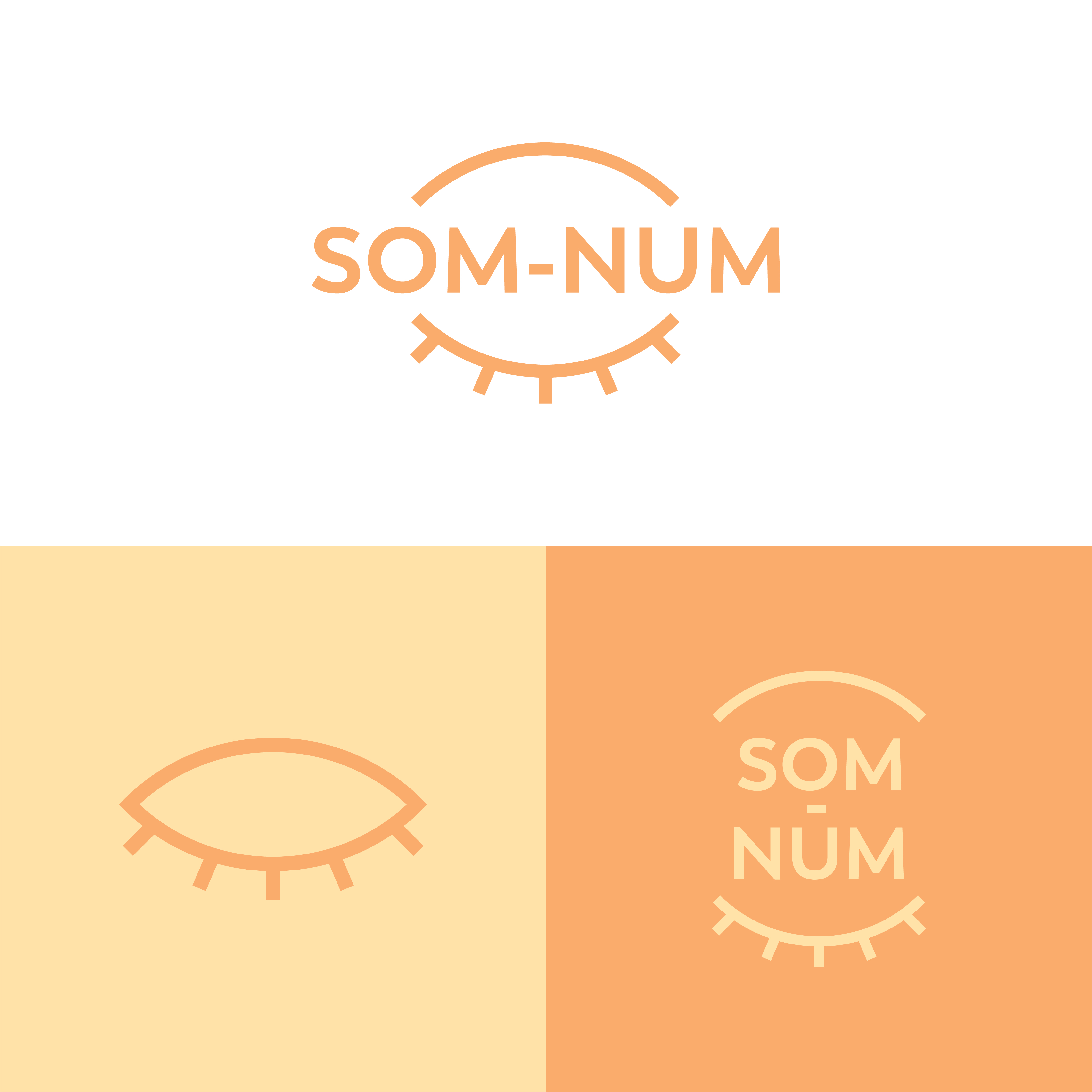
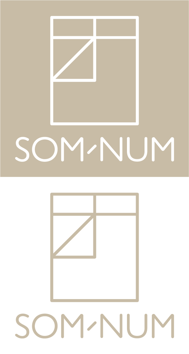
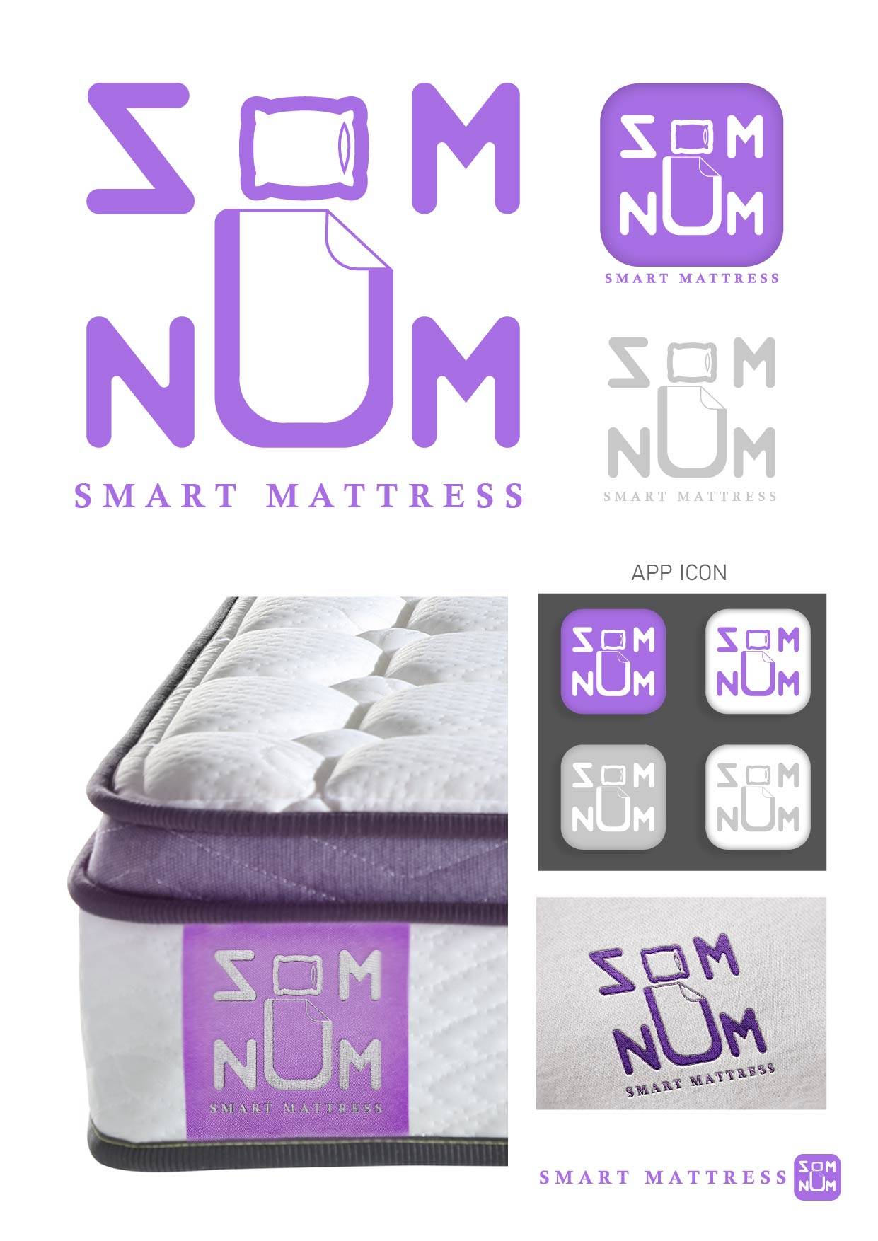
I tried to bring the coziness of the brand and the main essence of the brief which sleepy also written in brief though, it is also mentioned a lot of things about their business but in context, I think the real value should be shown in the logo and recognizable with users easily I made few more versions of it for that please check out on my work Behance
https://www.behance.net/gallery/146669615/SOM-NUM-%28Mattress-brand%29
https://www.behance.net/gallery/146669615/SOM-NUM-%28Mattress-brand%29
Som-Numlogo
 1 Like
 3
3
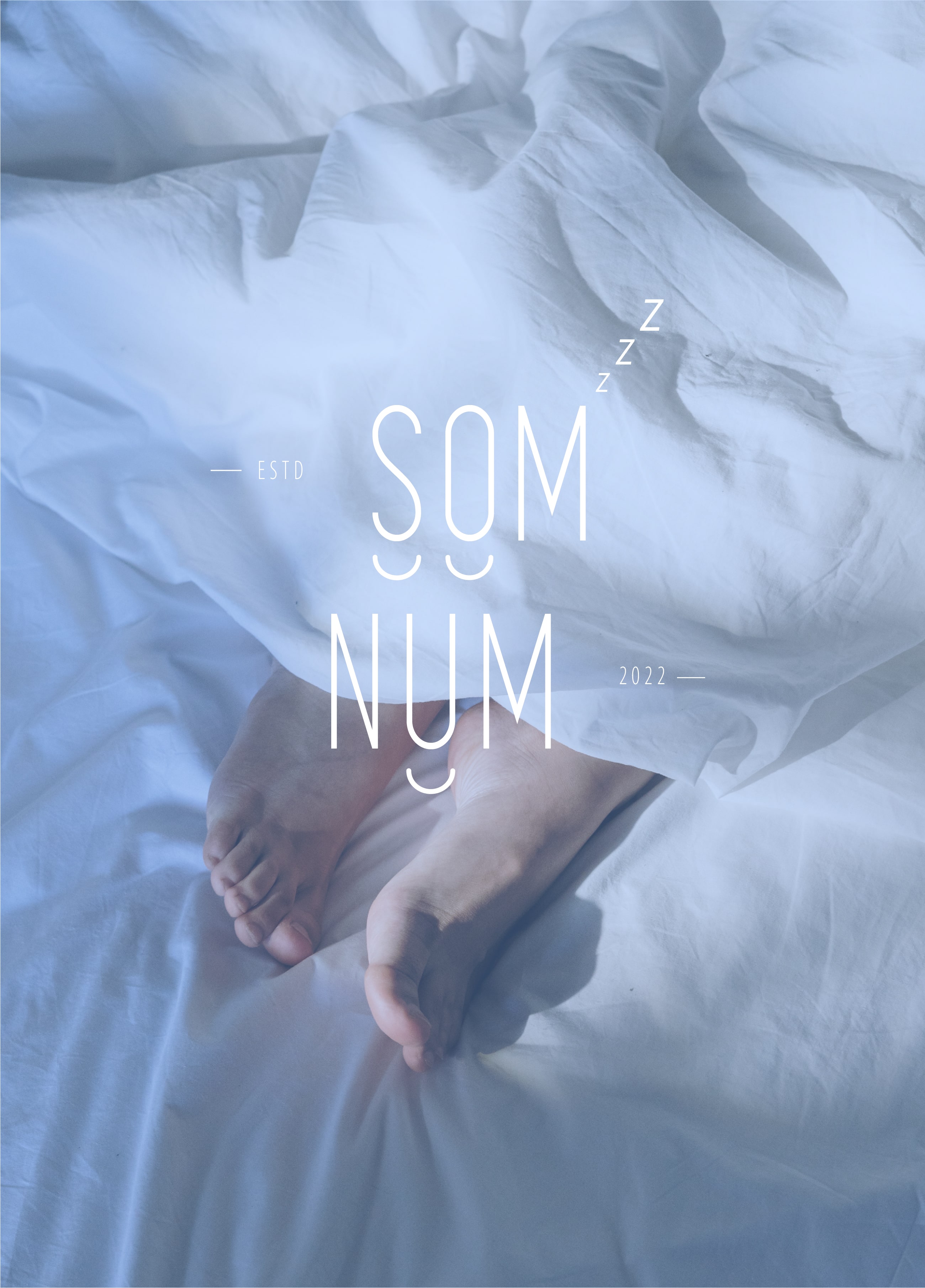
The logo is too busy and will not display well on small screens or an app icon like the brief says. It will also be difficult to embroider the "ESTD" and "2022." Simplifying it and having less small details will help. I recommend testing it as an icon on a phone to check. You can also check the competitor logos listed in the brief for examples. Hope you find this feedback helpful :)
1 year ago by Joshua - Reply
Fantastic job with the briefing, you made something not soo serius as the briefing asked and passed the products they sell in a easy way.
1 year ago by João Pedro Costa Lima - Reply
Thanks :)
1 year ago by Yash - Reply