Waw logo
- Report
1 year ago by Alvaro
Composition:
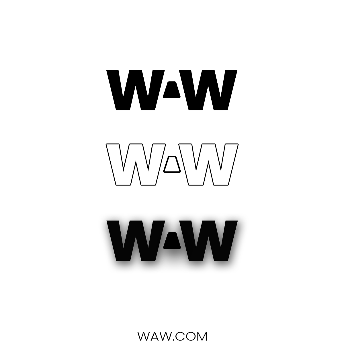
There are 2 letter "w" and i used the space between them to create a negative letter "a".
You can see 3 versions of the logo each of them have different uses
There are 2 letter "w" and i used the space between them to create a negative letter "a".
You can see 3 versions of the logo each of them have different uses
Hey,
I'm Sol, founder of Waw. For a while now, I've been looking for a good logo for my business. I think a lettermark will fit best. Can you do that?
I'm Sol, founder of Waw. For a while now, I've been looking for a good logo for my business. I think a lettermark will fit best. Can you do that?
