DTP Shipping Solutions
- Report
2 years ago by Ijeoma Theodora Osagie
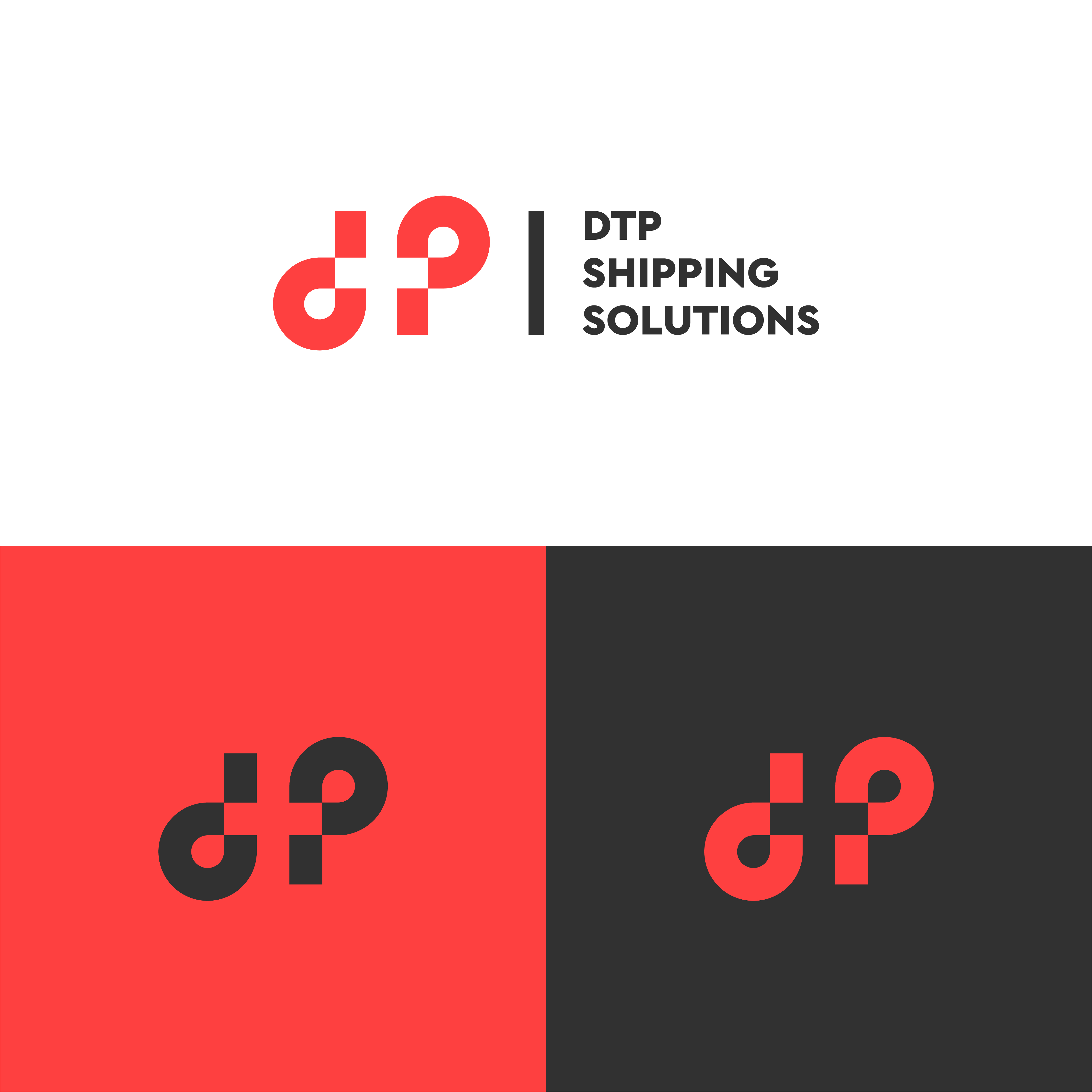
Design 2 for DTP Shipping Solutions.
 Like
Like
 1
1
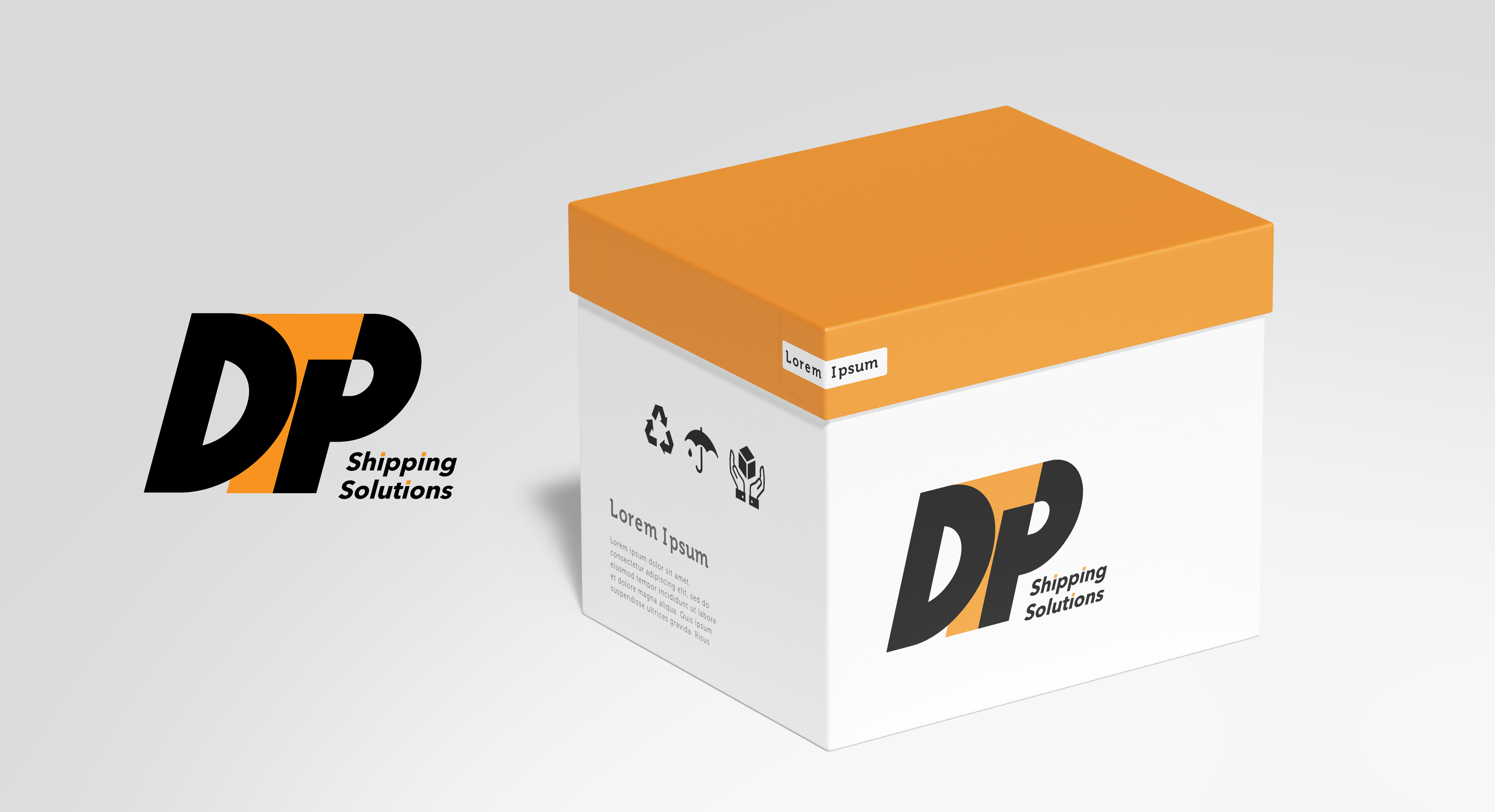
Gradients are a no-go for logos, I would try using more solid colours to build and layer the design more. Also consider font choice, is a shipping company likely to use a script font? Also ask yourself what makes you think shipping in this logo? I know its difficult, but this should send you on the right path :-)
Well done though!
2 years ago by Heaven Persephone - Reply