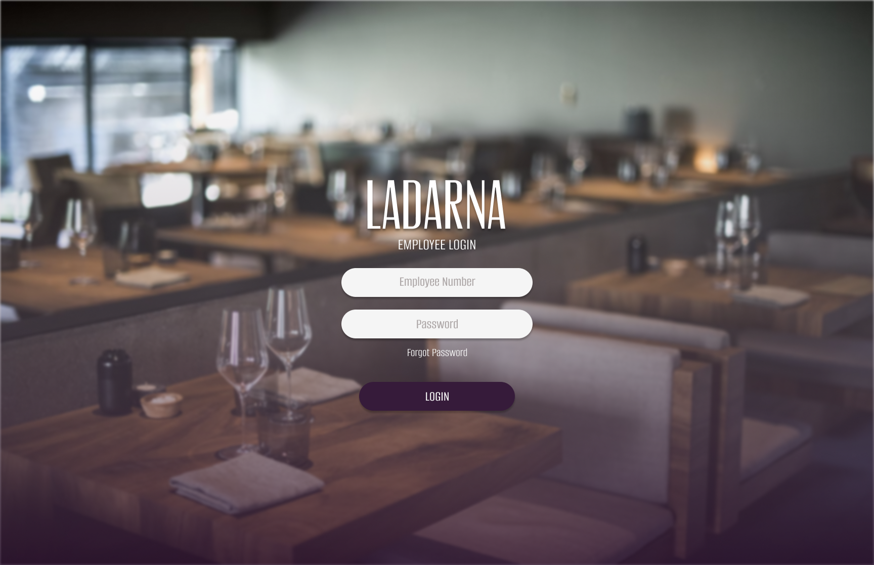
Ladarna Employee Login Site #2
- Report
2 years ago by Meagan Austin
This is the second design spec for this brief. Any constructive criticism is welcomed. 😁
Ladarna web
 3 Likes
 1
1
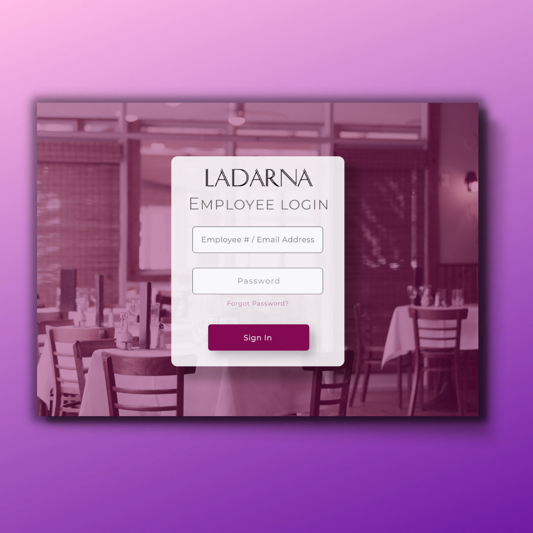
Very nice, classy! The only thing I’d consider changing is perhaps a brighter tone on your CTA button for a little more contrast. It might even add some symmetry, bridging the gap between the brightness of the left and the darkness of the right. It’s a nice design, great job!
2 years ago by A.T. Norman - Reply