Ladarna Employee Login Website 1
- Report
2 years ago by Meagan Austin
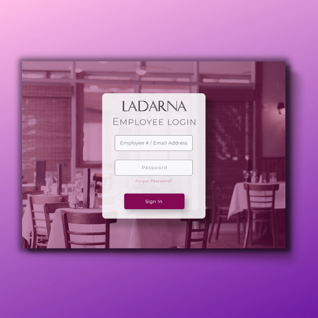
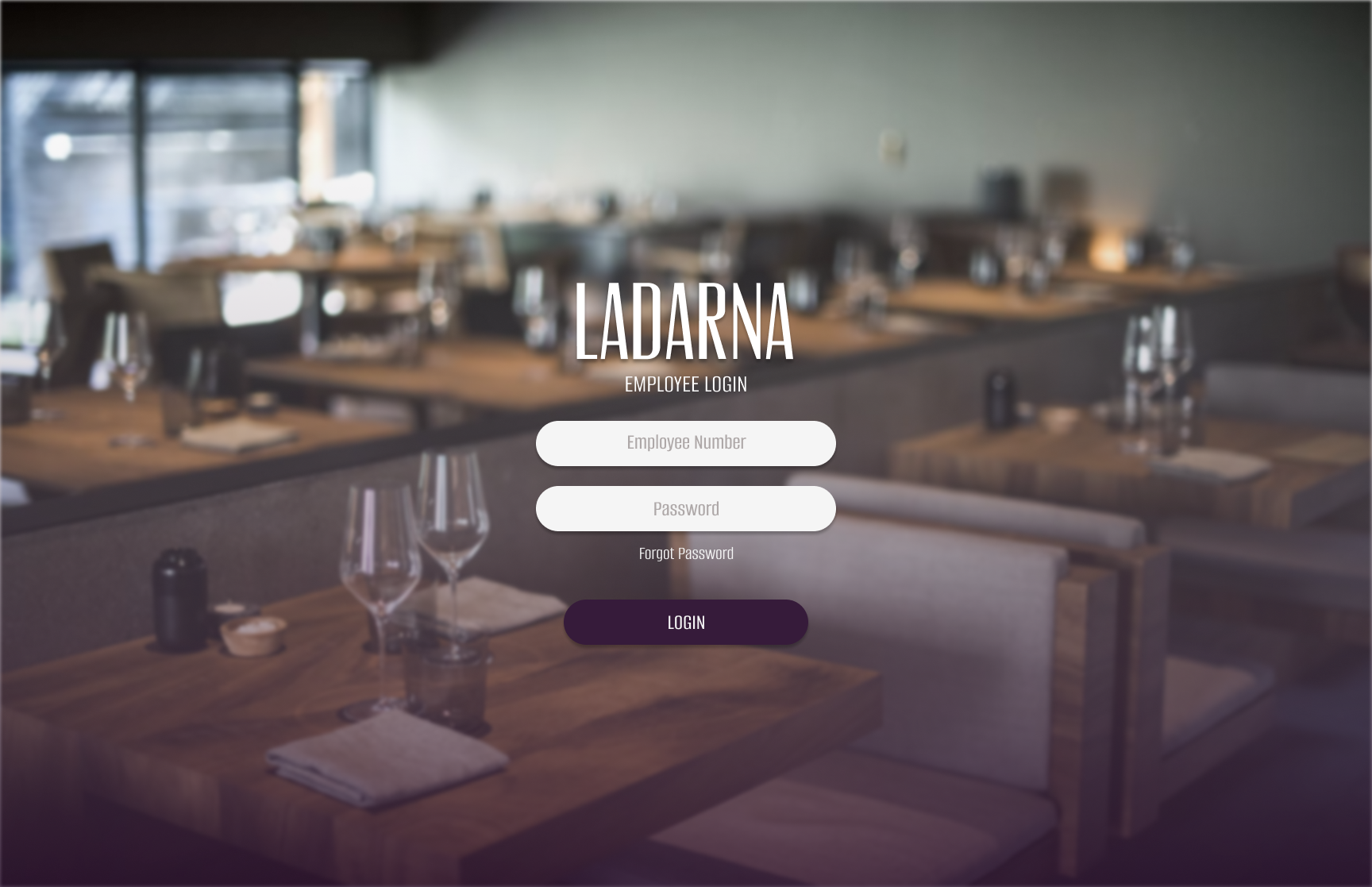
Hello! Since this is for a small yet high-end restaurant, I wanted to make it visually appealing, even though it is a login site. I used the three colors that the client preferred and made the login site as elegant and modern as possible. Any constructive feedback is welcome. :)
Ladarna web

 3 Likes
 2
2
Awesome job; sleek and modern! I do, however, have one suggestion… consider a different colour for your “Sign In” button (one that will contrast better). All around pro job though! Cheers!
2 years ago by A.T. Norman - Reply
Thank you so much for your feedback. I will work on finding a purple that stands out against the background! 😁
2 years ago by Meagan Austin - Reply