Som-Num Smart sleep system
- Report
4 years ago by Craig Y
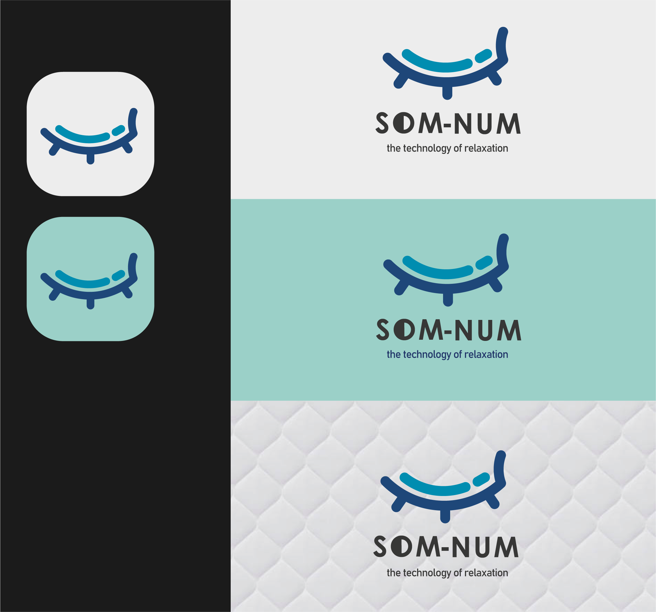
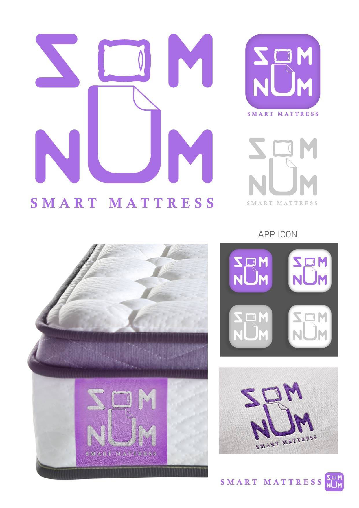
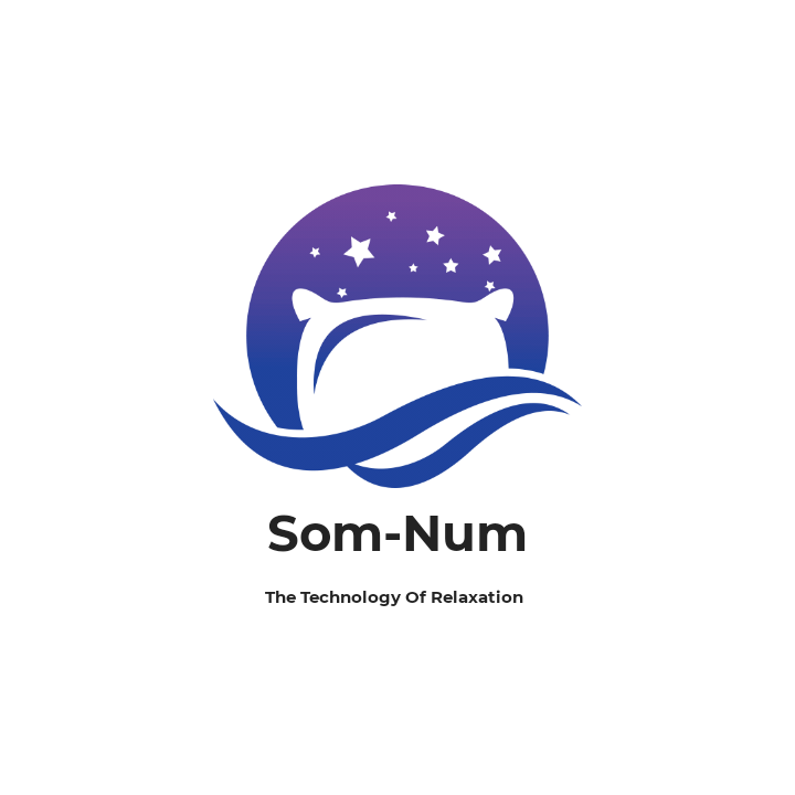
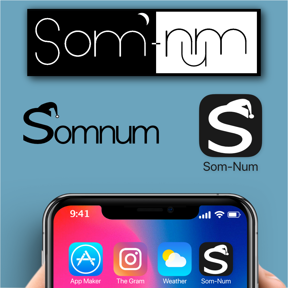
The brief asked for fun, not so serious, Scalable logo. I went with what I am calling "Sleepy S". Semi bold ish S with a "nightcap", I feel this Keep on message and is more similar to Casper as mentioned in the brief. I had another idea to incorporate a logo that had night and day again playing into the fun side with the moon over the "Som". Also, a different S to have something ready if the "Sleepy S" is too fun. that being said the sleepy s works in the space as well. Lastly in the day section I have snugged the N & M in the U because who doesn't like that in bed.
a tagline I would throw out there might be
"Sleep starts with... (Som-Num)"
So� whata you think???
a tagline I would throw out there might be
"Sleep starts with... (Som-Num)"
So� whata you think???
Som-Numlogo
 6 Likes
 1
1
I appreciated how well you understand the brief but the "S" gives me a kind of dark and black its looking like it giving me a kind of Goblin feel although the feel is not coming out properly hope some mockups and making some tweaks in typeface really help here :)
1 year ago by Yash - Reply