Sign in

Create an account

By signing up, you agree to the Terms and conditions and the Privacy policy

Sign In

Forgot your password? Reset Password

Som Num

2 years ago by Ally
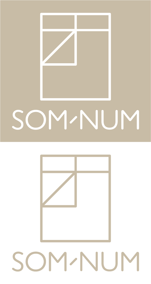
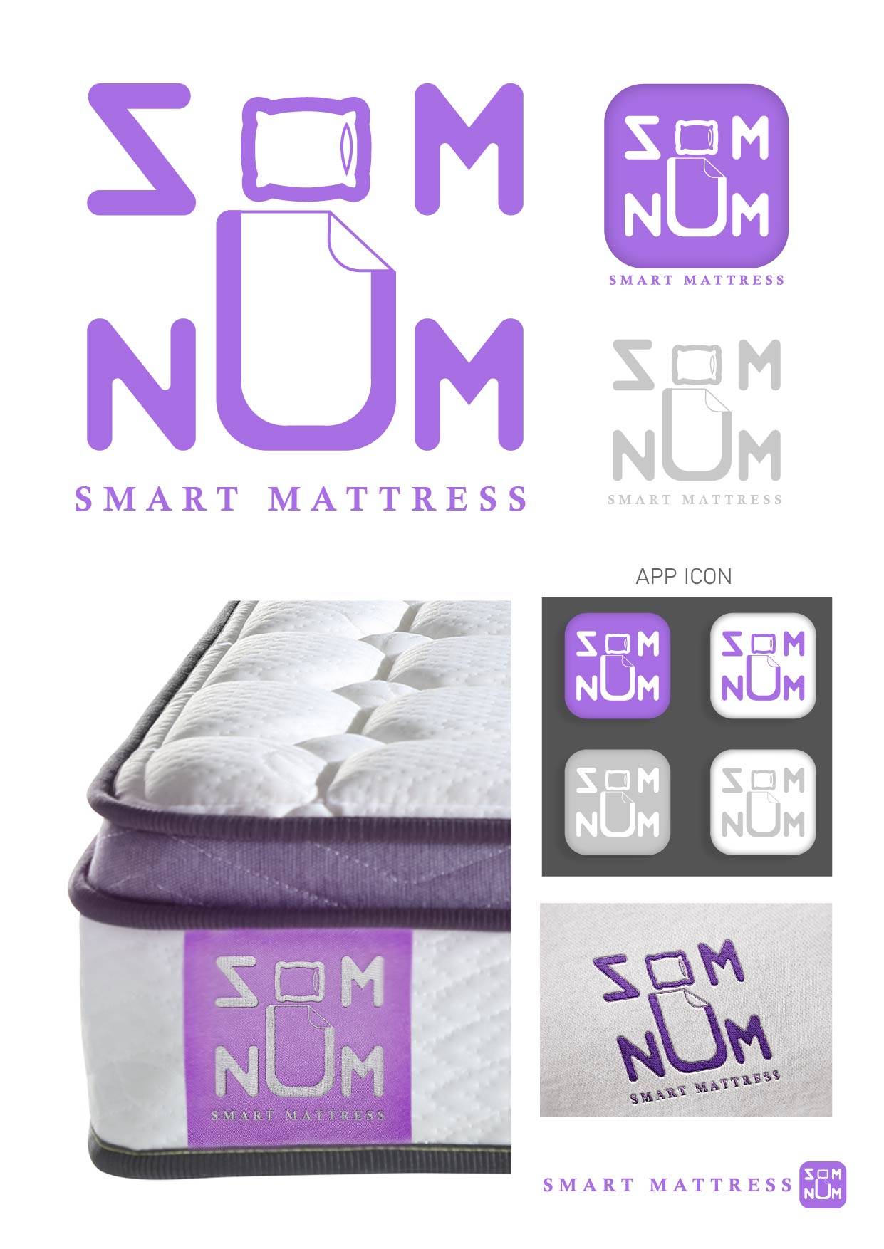
I removed the hyphen from the name as it still reads the same without but feels a little cleaner. I wanted to create a contemporary yet playful branding similar to that of Casper and Helix Sleep. Using the tagline 'because your bed is a place to connect' I played with the idea of connectivity in both technological and human physicality manners.

What do you think?
comment2

Sign in or create an account to comment on this post

Sign in Create an account
Hii Ally, maybe I think the picture is not coveying the real goal of a brand? but about the logo, it is clean, minimal, simple, and aesthetic too.
11 months ago by Yash - Reply
@allyrollinsonart www.allyrollinson.co.uk
2 years ago by Ally - Reply

Similar Posts

SOM - NUM: The technology of relaxation

2 years ago by alejandr0000
comment8

SOM NUM Logo Design

3 years ago by Tiffany
comment1

Som-Num Logo

3 years ago by Enzo
comment3

Som-Num

3 years ago by Rob Sollom
comment0

Som-Num Logo

1 year ago by Digital
comment2

Son-Num Logo

1 year ago by Jennivah delos Santos
comment2