Muud Logo
- Report
4 years ago by Alton Northup
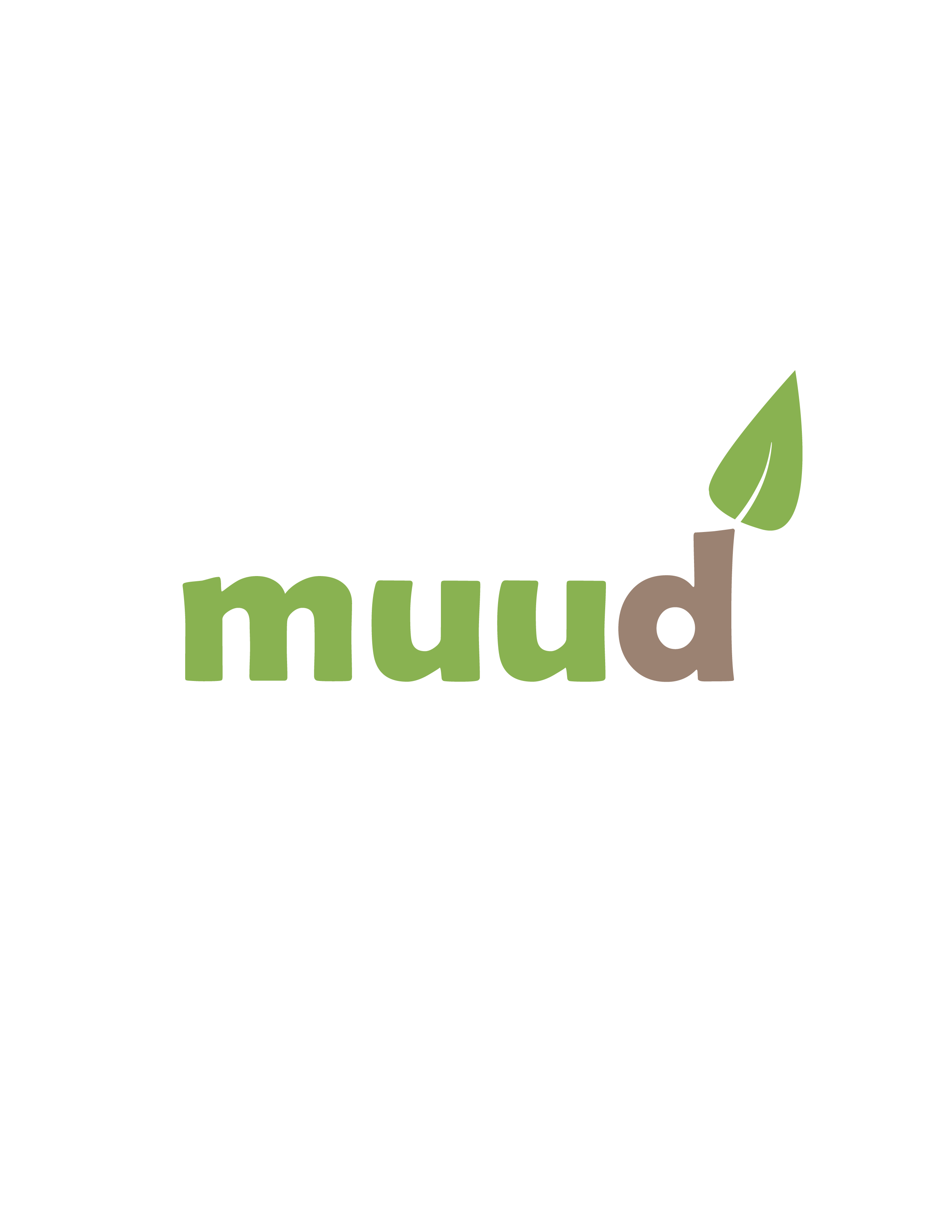
There was very little explanation for the company Muud, however I got a very natural feel from the name. i decided to go with the idea that the company made natural skin products. The logo has a very natural color scheme with colors found in nature. The leaf indicates the use of natural ingredients that create a product naturally made and safe for use. The leaf also has the effect of growing from a tree, in this case the d. Thank you!
very clean but the font can be better.
please give me feedback too , i am new here
4 years ago by kunal das - Reply
I really like this logo concept! Nice color combination. You immediately get a feel for the company. The only thing worth pointing out to me is that the leaf feels... off? I think it would match the font more if the leaf was more rounded. As it is now, it feels very triangular. Other than that, great logo!

4 years ago by Alex Strøm - Reply


