PANDA LOGO
- Report
4 years ago by khizar
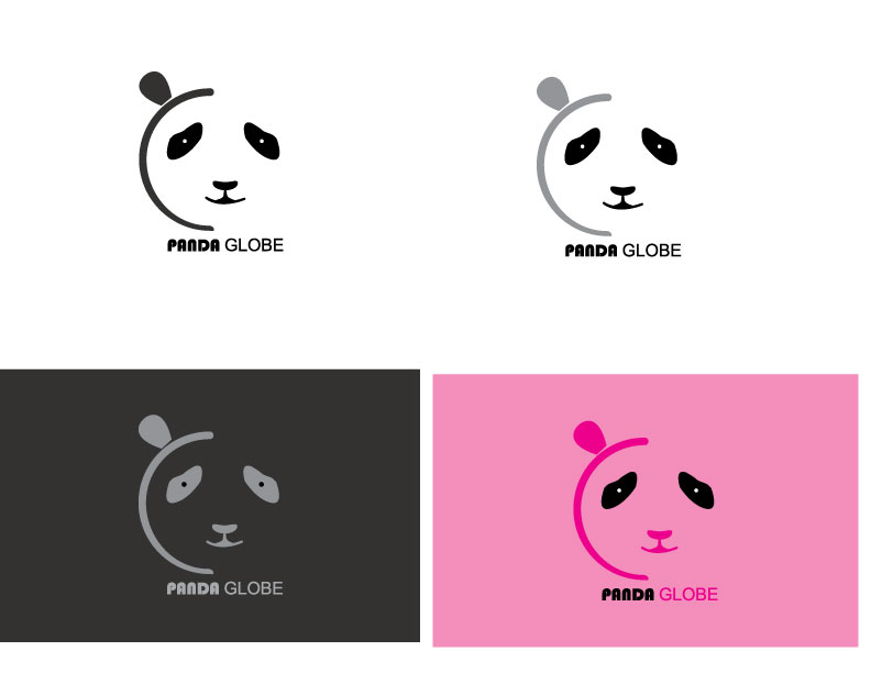
hi everyone.This is another logo i have made .please have a look on that and give me your experts suggestion and feedback i will be very thankfull to you
 2 Likes
 3
3
Like it. Like that the ear and line do the globe. Just not sure when it's smaller if the eyes won't disappear. Maybe do the circles bigger. Maybe the mouth too need raffinement.
4 years ago by Isa - Reply
Hi Khizar!
I like this logo. I think you've improved since the first logo i saw by you, which is awesome!
I like that it can work in both grayscale, as negative/positive and in color! :)
I would say though, that it feels a bit unbalanced. Maybe making the font larger and making a little space between the mark and typeface would also improve it!
Overall good job, nice to see you working hard :)
4 years ago by Alex Strøm - Reply
I really like it :)
4 years ago by jiri_pudich - Reply


